In what ways does
your media product use, develop or challenge forms and conventions of real
media products?
I
believe my music video follows most of the conventions concluded by Carol
Vernallis and Andrew Goodwin. Vernallis’s theory is based on the idea that the
editing is very clear and obvious and it also expresses that music videos do
not have the usual rules of “continuity”; as films or TV shows have, my music video has not a “continuity”
editing because in one shot we have the artist singing and walking towards the
camera and in the next one he is sitting on a different location, this sequence
of shots are repeated several times, which makes the editing very obvious and make it not continues in terms of story. There
is an effect that repeats itself each time, the artist sings the chorus, which
is the 8-point garbage matte effect, this changes the background of the shot
leaving the artist looking differently, this effect makes the editing even
clearer.
 |
| 8-poing Garbage Mate Effect. You can see the difference between the background and the artist, making the editing obvioius. |
|
|
|
The music video also has a series of jump cuts that draw attention to
it as the effect also does. The base
track is another conclusion of Vernallis theory that my music video follows,
because we have approximately 6 different base tracks that we use to give the
video a structure. Following Goodwin’s
theory my music video is classified as “Amplification” because it does not
contradict the lyrics but add layers of meaning. The lyrics talk about London,
how the interpreter is a traveller that is making the city of London his new
home and the video is showing London and the artist walking and singing, following
Goodwin’s theory.
Repetition
is something that I have got from the use of base tracks following Venallis’s
theory but also follows Goodwin’s conclusion about pop videos. The artist is looking at the camera in most of
the shots, trying to involve the viewer with the performance as Goodwin
convention says. The video does have a clear ending but does not build a climax
even though it has a change of speed before the climax of the song I did not
change the length between cuts so this is challenging this idea, but I think as
the song is quite slow the slightly change of speed before the climax work just
as well. The cuts of the video are done with the beat of the song which follows
the convention.
I
was influenced by 4 specific videos which are “The Man who Can’t be Moved” by
“The Script”, “The A Team” and “Drunk” by “Ed Sheeran” and “A la Primera
Persona” by “Alejandro Sanz”. Which one of these music videos, share the same
genre and also share shots and ideas that I transferred to my music video but they
have independent features that helped me very much to create an idea for my product.
The artists of these videos are not looking at the camera excepting the artist
in “The Man who can’t be moved” that looks at the camera briefly, so they
challenge Goodwin’s convention, they were a good point of reference to decided
if I wanted to challenge or follow the convention which at the end I decided to
follow because my artist is new so he needs the visual contact with the viewer.
Camerawork
and editing was the most influential part of these videos. I tried to use the
change of colour that I saw in the video “Drunk” by “Ed Sheeran”; in this video
the blue tone is noticeable and adds some sad and cold mood to the video so I
tried to recreate this because the lyrics of my song are about a difficult
time. Using colour corrector in editing I added a soft blue trying to get a cold
and a sad atmosphere which works very well. From the music video of “The Man
Who Can't Be Moved” by “The Script” I used the idea of the fast motion of cars
because it fitted very well in the idea of the city as a cold place. In
camerawork I followed the conventions of the genre and the main idea of the
music video which is to promote the artist, I used a sequence of Close ups and
Medium close up and Long shots to achieve this but mainly CUs and MCUs.
 |
| Traffic Scene in "The Man Who Can't Be Move" by "The Script" and in my music video. |
 |
| You can see that both images have a blue tone. Image from "Drunk" by "Ed Sheeran" and my music video |
All
of these videos share 2 types of shots and share 2 similar base tracks. Close up and medium close up are the shots
that they share and the base tracks that share are, that the artists are
sitting on the pavement and walking around in a city. These particular shots
(sitting on the pavement and walking around) I have used them in my music video
because, firstly it fits into the initial idea of the video, which was to
promote the artist, as well as, show London as the location of the music video
and secondly because all the videos that I had analysed have it, so it follows
the conventions of the genre.
 |
| Pavement Base Track |
 |
| Walking base track |
The
mise-en-scene of these videos was very simple so I also followed that, the only
prop that we used was a guitar which is the main convention of the indie rock
genre. It was a very simple performance just the artist singing looking at the
camera connecting with the audience. As “Ed Sheeran” our artist try to sell his
music and not his image or personal style and I the video reflects that, with simple
clothing following the convention of the genre.
Overall
I believe my music video follow the conventions, not only Goodwin’s and
Vernallis’s but also the conventions of the indie rock genre.
During
the production of my ancillary product I was very careful about the conventions
of my genre because it is very easy to get out of them and I also had the list
of Do’s and Don’ts at all time. I researched many different examples of digipaks
and adverts inside the indie rock genre, trying to get the better of each one,
I had to have in mind that my artist is a new artist and one of the priorities
to make the ancillary work successful, is to promote his face to get the people
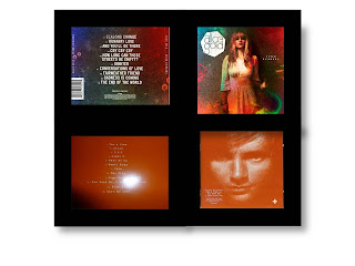
to know him. My digipak was influenced mainly by the digipak of “+” by “Ed
Sheeran” and “Seven Rainbows” by “Alice Gold”, their digipaks are very simple
and they share the same genre so I could be sure that I would be following the
conventions. The front covers of these digipaks are all about the artist which
for me is very important, in "Ed Sheeran's" cover there is close up of his face and in "Alice Gold". On the back cover I left the same effect that is on the front cover, trying to keep it simple following the convention and influenced by the same two digipaks. I followed the conventions of the digipaks there is no more than two colours in the panels and I used the same font for all the lettering, changing just the size and colours of some words. The font was very important not only because it is a convention but its also telling the viewer, who's work is it and if the font is unclear the ancillary product fails its purpose.
 |
| You can see that my front cover just have one effect, as "+" and "Seven Rainbows" have. The picture is very similar to the one at the right below but I tried to promote the artist even more, leaving his face as the predominant thing on the cover. |
 |
| You can see that the digipaks have just 1 effect that is in both front and back cover. The position of the picture is to introduce the artist to the buyer which is a convention that I tried to follow. |
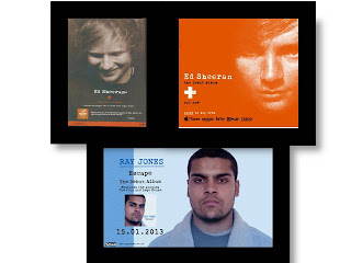
All the panels of mi digypak have a blue tone trying to create the link between the advert, the digipak and the music video. The ancillary work, all have the same colours which are blue and black, by having minimum colours I am following the conventions of the indie genre which is all about simplicity. I looked at many different adverts before I took the decision about the layout of my advert but It is mainly influenced by the magazine advert of the digipak "+". The image of the artist is looking at a point very close to the camera influenced by the "+" advert that is at the top right side of the image, but the picture of my advert does not have any effect on it so the audience can recognise his face. The font is very clear and keeping the same colours,blue and black. The advert and the digipak have the same effect to create the link between them.
 |
| You can see the influence; I opted for the layout of the right because for me gives more space. |
I follow the classic conventions as well as the conventions of my genre.


No comments:
Post a Comment